
Default plots often include a few or many bars of misleading data where a strategy may have zeros or NAs compared with the benchmark, for example where the strategy uses a moving average lookback period before generating a trade signal. There’s a simple way to start the plot after the strategy is generating signals, and it improves quality of the stats generated too. I don’t see this tip often used in R code examples posted online, so I’m jotting it down here in case other quantmod and PerformanceAnalytics newbies want this improvement. I’ll include this usage in all the future versions of quant_rv too.
Let me show you the problem. Let’s look at SPY over the past couple of years, through this Inflation Conflagration time in the market. Here’s a simple Death Cross / Golden Cross strategy [long at the open each day SMA(SPY,50) > SMA(SPY,200) at previous day close] with a default plot from PerformanceAnalytics package, data starting at the beginning of 2021:

Well, that’s nice, buy-and-hold SPY benchmark is clearly on top, except why is our strategy flat during the first 3/4 of 2021? Oh right, there’s no data until after we have waited for 200 days of SPY to process through our algorithm. So this isn’t a fair comparison at all. SPY benchmark starts Jan 1 2021, our Golden Death doesn’t kick in until Oct 20 2021!
Let’s try backing up 200 days and try again, so we’ll start around Mar 18, 2020:
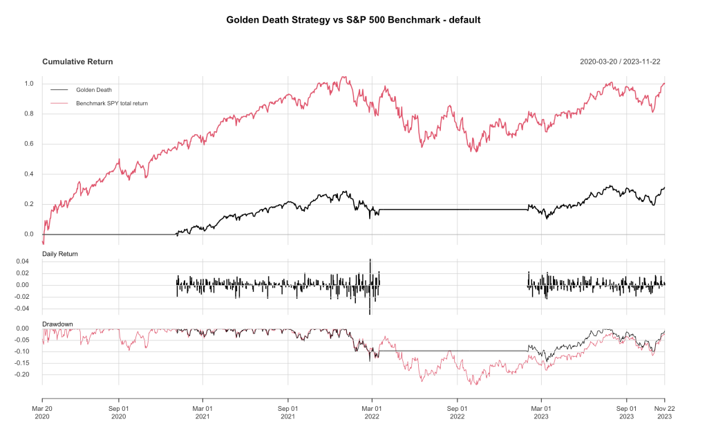
Oh, much better and worser! Now our Golden Death strategy properly starts at the beginning of January 2021, but the benchmark gets a 200 day headstart when the market was rocket-fueled from all the stimulus coming out of the Covid Crisis! How do we properly compare these data sets?
In my R finance explorations into quant_rv so far, this hasn’t been much of a problem, because I don’t have long lookback periods. I have simply ignored this issue, although it is there, skewing in a very minor way the annual returns and Sharpe ratios and such I’ve been reporting. But I wanted to know how to deal with this, and I wasn’t finding it in the code samples I could find in blog posts and such.
So I looked up the docs for chart.PerformanceSummary() in the PerformanceAnalytics package, since that’s what we’re using for the plot. Here’s a link easily found by searching the web: https://rdrr.io/cran/PerformanceAnalytics/man/charts.PerformanceSummary.html
Useful, but it doesn’t say anything about starting date or ending date or anything helpful about controlling the X-axis. The best clue I found was that PerformanceSummary seems to use the base R plot() function in R graphics. Here’s a link for that: https://www.rdocumentation.org/packages/graphics/versions/3.6.2/topics/plot
but once again nothing about controlling the timescale on the X-axis. Grr.
So what do we do next? Maybe we have to chop up our data instead, get the slice of the data we want to plot and plot that slice. This R approach to backtesting uses XTS objects to hold the data, because that’s what quantmod uses. XTS objects are a type of matrix of data internally, with a date/time index and a lot of superpower functions written on top for manipulating. Here’s a decent link describing the main superpowers of XTS objects: https://www.datacamp.com/cheat-sheet/xts-cheat-sheet-time-series-in-r
Buried down in there, in a section called “Subset”, are the clues we need. Here’s an example from there:
xts5_janmarch <- xts5["1954/1954-03"]Easy huh? You have a XTS object xts5, and you use square brackets with a date range separated by a /slash to get your date-based subset. Further, it understands months and years and such. Here would be a few more examples:
xts5_beginning_to_march01_1954 <- xts5["/1954-03-01"]
xts5_march01_1954_to_end <- xts5["1954-03-01/"]
xts5_march01_1954_to_march01_1957 <- xts5["1954-03-01/1957-03-01"]
That’s just what we’ll use here in our code to produce this plot:
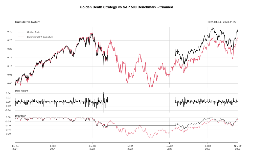
There it is, a nice example where a Death Cross/Golden Cross pair did what it was supposed to, get us out of the market as the market went down and back into the market as the market rose again, reducing our exposure to the drawdown and (in this case) actually coming out ahead of SPY by a few points.
Here’s the R code for our Golden Death strategy and slicing the XTS objects to get the correct plot.
### Demo-Death-Cross.R by babbage9010 and friends
### released under MIT License
# Simple "Golden Death" strategy
#  Signal is true at daily close if SMA(SPY,50) > SMA(SPY,200)
#  Strategy goes long at the open on the next day, or sells at the open
#    if signal returns 0
# variable "sdp" is used to display the proper plot of strategy vs benchmark
# without comparing the 200 day lag while SMA(SPY,200) is being calculated
# Some commented out code was used to make the other plots in the blog post
# originally published Nov 23 2023

# Step 1: Load necessary libraries and data
library(quantmod)
library(PerformanceAnalytics)

#dates and symbols for gathering data
#setting to start of 2021
#date_start <- as.Date("2021-01-01")
#setting back 200 trading days
#date_start <- as.Date("2020-03-18")
#setting to start of SPY trading
date_start <- as.Date("1993-01-29")
date_end <- as.Date("2034-12-31") #a date in the future
symbol_benchmark1  <- "SPY"  # benchmark for comparison
symbol_signal1 <- "SPY"  # S&P 500 symbol (use SPY or ^GSPC)
symbol_trade1  <- "SPY"  # ETF to trade

#get data from yahoo
data_benchmark1 <- getSymbols(symbol_benchmark1, src = "yahoo", from = date_start, to = date_end, auto.assign = FALSE)
data_signal1 <- getSymbols(symbol_signal1, src = "yahoo", from = date_start, to = date_end, auto.assign = FALSE)
data_trade1 <- getSymbols(symbol_trade1, src = "yahoo", from = date_start, to = date_end, auto.assign = FALSE)

#use these prices
prices_benchmark1 <- Ad(data_benchmark1) #Adjusted(Ad) for the #1 benchmark
prices_signal1 <- Ad(data_signal1) #Adjusted(Ad) for the signal
prices_trade1 <- Op(data_trade1) #Open(Op) for our trading

#calculate 1 day returns (rate of change)
roc_benchmark1 <- ROC(prices_benchmark1, n = 1, type = "discrete")
roc_signal1 <- ROC(prices_signal1, n = 1, type = "discrete")
roc_trade1 <- ROC(prices_trade1, n = 1, type = "discrete")

#the strategy
spy50 <- SMA(prices_signal1, 50)
spy200 <- SMA(prices_signal1, 200)
signal_1 <- ifelse(spy50 >= spy200, 1, 0)
signal_1[is.na(signal_1)] <- 0

#calculate returns
returns_benchmark1 <- stats::lag(roc_benchmark1, 0)
returns_benchmark1 <- na.omit(returns_benchmark1)
label_benchmark1 <- "Benchmark SPY total return"

returns_strategy1 <- roc_trade1 * stats::lag(signal_1, 2)
returns_strategy1 <- na.omit(returns_strategy1)
label_strategy1 <- "Golden Death"

#combine returns into one XTS object, add column names
comparison <- cbind(returns_strategy1, returns_benchmark1)
colnames(comparison) <- c(label_strategy1, label_benchmark1)

#default chart and stats: uses full data downloaded
#charts.PerformanceSummary(comparison, main = "Golden Death Strategy vs S&P 500 Benchmark - default")
#stats_default <- rbind(table.AnnualizedReturns(comparison), maxDrawdown(comparison))

#trimmed plot and stats
# sdp = start date for plotting
sdp <- "2021-01-01/" #start date for our plot in this blog post
#other sample sdp examples
#sdp <- "/"  # same as default, use all the data downloaded
#sdp <- "/1995-12-31" # all data to end of 1995
#sdp <- "1993-11-13/1995-12-31" # start after 200 days, to end of 1995
charts.PerformanceSummary(comparison[sdp], main = "Golden Death Strategy vs S&P 500 Benchmark - trimmed")
stats_gd <- rbind(table.AnnualizedReturns(comparison[sdp]), maxDrawdown(comparison[sdp]))
Nothing earth shattering today, just learning and improving our R coding. I’ll be using this method going forward with quant_rv, making sure to compare without a few days (or more) of improperly missing data in our strategies at the beginning of each period examined.
~babbage

Leave a comment