Author Note, 11-Sep-2023: The new post is here.
Author Note, 26-Aug-2023: Corrected code is below. Ignore the figures too, I’ll be making a new post with new figures soon. Also can ignore my conclusions… there’s not much of a low vol anomaly showing up in this manner of exploring the data. Slim pickins.
Author Note, 23-Aug-2023: There are data/code errors here, working on fixes. I’ll likely recant some findings from this post on the next post. Thanks to Smoosh for commenting on this!
A big issue for me with this project is: how do we validate this whole approach? We started out with a super simple vol-based timing strategy (long/flat market exposure). I rather glibly state that realized (or perhaps more properly, historical) volatility is a “sensible, logical, statistically meaningful” market observation. But is it? The real “low volatility” anomaly (documented in academic studies ad nauseam) in stocks is that individual stocks with low volatility perform well on risk-adjusted measures versus their “high volatility” counterparts. What I’ve been claiming is different: that low volatility periods in the major market indices also provide a risk-adjusted performance bonus over high vol periods. But do they, and if they do, why or how or what is the nature of this outperformance?
It’s not that easy to dig up academic articles addressing this, partly because the “real” low vol anomaly so completely dominates the research. That is one thing, plus I sense there is such an aversion to “market timing” strategies across the financial analysis/advice universe that there aren’t many good search queries that filter out the “real” anomaly articles. I’m working on it, slowly. If you find something new/old/useful, please let me know. I tire of reading that investors need “time in the market”, and not “market timing”.
Here’s one recent article providing some related findings: “Timing the factor zoo”, from March 2023, available at SSRN. The short of it is the authors looked at factor-based portfolios, and found that timing them with momentum and volatility could improve them. That’s still not at all what I have claimed and have based the past eight posts on, so I’m going to bite the bullet, learn some new R tricks to perform some XDA (EDA?) to see if I can document/demonstrate this claim a bit, or disprove it perhaps. Let’s find out.
First up, perhaps we should see if there’s any relationship between volatility and lagged SPY returns. Our heatmaps post earlier hinted that there is such a relationship, by looking at a variety of lookback periods and thresholds to see if the period from July 2006 to Dec 2019 was profitable, in a risk-adjusted sense. And it was profitable, Sharpe-wise, so there must be other ways to document this. Let’s start with some simple things:

So, there we have Close-to-Close volatility with a 20-day lookback period (x-axis) plotted versus 2-day lagged SPY Open returns (y-axis). Full disclosure: in case you haven’t read all the previous posts, we’re looking at a 2-day lag so that we can calculate realized vol after the market closes, and invest the next day at the market Open. A 2-day lag calculates return from that Open to the next day’s Open. A 1-day lag would allow you to future-peek and invest Open-to-Open on the very day you’re calculating your realized vol for SPY.
But it looks kinda worthless, to me. Sure there’s a teensy bit of negativity to that red regression line slope, so it looks like the low vol left side has a little higher returns than the high vol right side of the plot. But nothing to write home about, let alone a blog post.
So, we dive deeper. I had to learn some basic (to everyone else) data handling for this part, but I now show you three different bar charts of binned volatility data and calculated the mean daily returns for each vol bucket. Here’s the goods for that same plot above:

Four plots, the first (upper left) is a repeat of the first plot. Upper right is a bar chart of volatility deciles, with the mean daily return for SPY plotted as the y-axis. BOOM! We have our low volatility market timing validation! Or not, but we’re off to a good start. Let’s look at the other two plots: lower left is a 30 bucket bar chart, and the lower right has 100 buckets (about 33 returns/data points per bucket). So, it’s a little messier in the details, but the big picture remains that the low vol left side of the bar chart definitely has a tendency toward positive daily returns. I don’t think it gets much clearer than that.
We have to go a little further than that, of course. Does it work with other lookback periods, or did we just get lucky with lookback=20? Well, here’s a 10-day quad plot:

Looks about the same, pretty similar, except with four negative buckets on the right instead of three. Even the 30-bucket and 100-bucket charts look solid on the left side, dominated by positive daily returns, and choppy ups and downs on the right side. How about an even shorter lookback period?
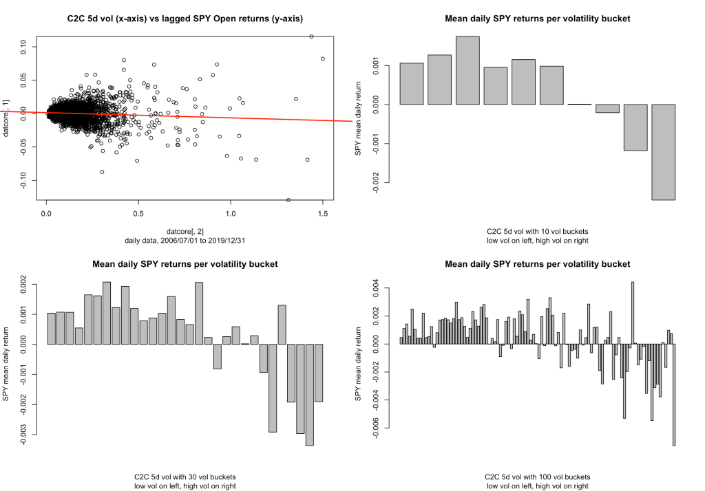
Yep, that’s a five-day, one-week lookback period, still showing a super solid set of low vol positive return buckets. You can run the code yourself, I did, down to 4-day, 3-day, and even 2-day loopback periods, and you still get the same pattern.
Where it falls apart, it seems, is in the quite long lookback periods. I’m not sure why we might use a 100-day lookback period for a strategy that is focused on daily signals, but it’s useful to note this:
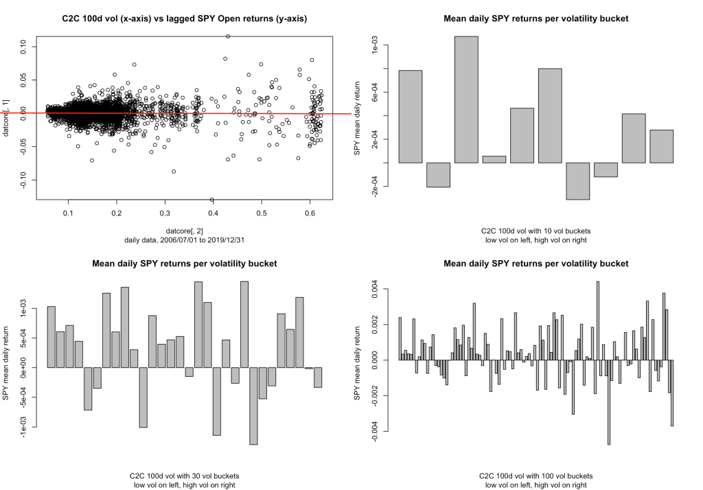
If you squint, there’s still a bit of a low vol positive anomaly, maybe, but I think I have to say that it’s pretty much gone up here in the long lookback region. I’ve been focused in the shorter periods anyway, because that’s where my interests for quant_rv lie, but I throw this out there because it’s interesting and somebody might explore it and make something of it. I didn’t really expect it to fall apart like that.
So, next up… multiple vol measures. How do the other vol measures we’ve been talking about hold up? Again, TL;DR, they hold up pretty well, similar low-vol/positive-returns patterns. Here are the 20d quad plots for PARK (Parkinson), RS (Rogers-Satchell), and GK-ZY (Garman-Klass, Yang-Zhang) volatility measures:


One more thing: is this low vol anomaly there because the winning days are winnyer (bigger wins), or are there just more of them? I’m just going to give this a quick look right now, but the following multiplot adds three new bar charts representing the Win % for each bucket, and there’s a red horizontal line across each of them at the 54% mark, which is just about the average win % for SPY during this time period.
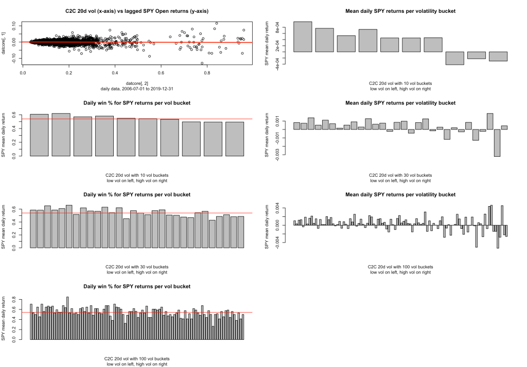
For each of the three new bar charts, you can see the low vol anomaly where there are more bars sticking up above the red line on the left side. So clearly there is a higher win % in our low vol anomaly. I haven’t tried the relative size of the wins vs losses yet, maybe soon.
So there’s my first attempt at documenting this “low vol market index timing anomaly”. I’d be much pleased if someone could point me to where it’s documented elsewhere, I’m sure it’s out there and I’m just missing it. And if anyone has some tips on other code/plots to shine more light on this anomaly, I’d be very glad to hear about it. Here’s the code I used, with just enough commentary to figure out how to edit and make all the plots, I think.
### rv_vs_rtns_0.0.1.R by babbage9010 and friends
# CORRECTED CODE BELOW (see #COMMENT blocks)
# initial release
# this code is really weak, I barely knew what I was doing when I
# started, but it's my start.
### released under MIT License

# Step 1: Load libraries and data
library(quantmod)
library(PerformanceAnalytics)

start_date <- as.Date("2006-07-01")
end_date <- as.Date("2019-12-31")

getSymbols("SPY", src = "yahoo", from = start_date, to = end_date, auto.assign = FALSE) -> gspc_data
pricesAd <- na.omit( Ad(gspc_data) )
pricesOp <- na.omit( Op(gspc_data) )
pricesCl <- na.omit( Cl(gspc_data) )
pricesHi <- na.omit( Hi(gspc_data) )
pricesLo <- na.omit( Lo(gspc_data) )
# choose one of those here
trade_prices <- pricesOp
signal_prices <- pricesAd
bench_prices <- pricesAd


#plot it
roc1 <- ROC(signal_prices, n = 1, type = "discrete")
lookbk <- 20
rv20 <- runSD(roc1, n = lookbk) * sqrt(252)
rs20   <- volatility(gspc_data, n=lookbk, calc="rogers.satchell")
gkyz20 <- volatility(gspc_data, n=lookbk, calc="gk.yz")
park20 <- volatility(gspc_data, n=lookbk, calc="parkinson")

#choose one of these to uncomment
x_dat  <- rv20; x_dat_label = "C2C"
#x_dat <- rs20; x_dat_label = "RS"
#x_dat <- gkyz20; x_dat_label = "GKYZ"
#x_dat <- park20; x_dat_label = "Park"

vollabel = paste(x_dat_label," ",lookbk, "d vol",sep="")

#y - SPY open lagged returns
roc_trade1 <- ROC(trade_prices, n = 1, type = "discrete")
returns_spy_open <- roc_trade1
#CORRECTION: lag here was used incorrectly
#NO! ORIGINAL LINE:  returns_spy_open <- stats::lag(returns_spy_open, 2)
returns_spy_open <- stats::lag(returns_spy_open, -2)
# We normally use a two-day lag(x,2) on a signal to match it properly with Open-Open
#  returns from two days in the future, corresponding to reading a signal after a Close
#  then trading as needed on the following Open (ie, in the morning for this case).
#  BUT I accidentally applied the same +2 open to align the RETURNS to the volatility
#  measures here. This pushes the returns forward two days instead of pushing the signal
#  forward... meaning the signal was aligning with an Open-Open return from two days
#  previous, giving us an unrealistically gorgeous correlation and low vol anomaly.
#  Run it yourself to see that now it looks pretty close to random with this setup.
#  More exploration to come.
y_dat <- returns_spy_open

#rid of NAs to even up the data (tip: this avoids NA-related errors)
dat <- as.xts(y_dat)
dat <- cbind(dat,x_dat)
dat <- na.omit(dat)
datcore <- coredata(dat)


# barcharts of SPY returns per volatility bucket
pl1 <- plot(x=datcore[,2],y=datcore[,1], sub="daily data, 2006/07/01 to 2019/12/31",main = paste(sep="", vollabel," (x-axis) vs lagged SPY Open returns (y-axis)"))
pl1 <- abline(reg = lm(datcore[,1] ~ datcore[,2]), col = "red", lwd = 2)

# Set for four graphs, or seven including 3 mean daily SPY returns plots
numrows <- 4 #either 2 or 4 please
# Set up 2x2 graphical window
par(mfrow = c(numrows, 2))

# Recreate all four/seven plots
pl1 <- plot(x=datcore[,2],y=datcore[,1], sub=paste(sep="","daily data, ",start_date," to ",end_date),main = paste(sep="", vollabel," (x-axis) vs lagged SPY Open returns (y-axis)"))
pl1 <- abline(reg = lm(datcore[,1] ~ datcore[,2]), col = "red", lwd = 2)

if(numrows == 4){
  pl2 <- plot.new()
}
#helper function
winpc <- function(vec){ sum(vec > 0) / sum(vec != 0) }

qnums <- c(10,30,100) #number of quantiles (buckets) (eg 10 for deciles)
for(q in 1:3){
  qnum <- qnums[q]
  xlabel = paste(vollabel," with ",qnum," vol buckets",sep="")
  decs <- unname(quantile(datcore[,2], probs = seq(1/qnum, 1-1/qnum, by = 1/qnum)))
  decs[qnum] <- max(decs) + 1
  decsmin <- min(decs) - 1
  #loop through volatility buckets to get mean returns
  means <- c()
  wins <- c()
  for(i in 1:qnum){
    # datx = data segment from x_dat[,1] (returns) to summarize
    lowbound <- ifelse(i == 1, decsmin, decs[i-1])
    hibound <- decs[i]
    datx <- ifelse( datcore[,2] >= lowbound & datcore[,2] < hibound, datcore[,1], NA)
    datx <- na.omit(datx)
    means[i] <- mean(datx)
    wins[i] <- winpc(datx)
    #print( paste("decile",i,"mean:",means[i],"vol range:",lowval,"-",hival) )
  }
  barplot(means,xlab=xlabel,ylab="SPY mean daily return",main="Mean daily SPY returns per volatility bucket",sub="low vol on left, high vol on right")
  if(numrows == 4){
    barplot(wins,xlab=xlabel,ylab="SPY mean daily return",main="Daily win % for SPY returns per vol bucket",sub="low vol on left, high vol on right")
    abline(h=c(0.54),col="red")
  }
}
(note: code was slightly edited after initial publishing to address some minor improvements. The GitHub has the changes if you really need to know.)
References:
Neuhierl, Andreas and Randl, Otto and Reschenhofer, Christoph and Zechner, Josef, Timing the Factor Zoo (March 24, 2023). Available at SSRN: https://ssrn.com/abstract=4376898 or http://dx.doi.org/10.2139/ssrn.4376898

Leave a comment