There is grave danger in tying your strategy to one selected set of parameters, particularly if those parameters are cherry picked to give more exciting results than other possible choices. I’m trying to working to avoid that in quant_rv. So far, quant_rv has two main parameters that can vary: the lookback_period for calculating realized volatility, and the volatility threshold used as a cutoff to invest during low vol periods. Our strategy efforts so far have looked at those parameter choices mostly one pair at a time, and compared them to both a SPY total return benchmark and the original parameter pair of 20 days and 0.15 threshold volatility.
There’s no new R code here, just simple modifications to the R codes we’ve already used and published here. Get them from the previous posts or from the GitHub.
Then we looked at the parameter space more broadly, using heatmaps to visualize the parameter space for both annualized return (CAGR) and Sharpe ratio. These maps give us a better overall picture of which parameter pairs (in that space) might be more likely profitable, if the future of the ETF space is anything like the recent past.
Let’s take another look at those heatmaps. Or, actually, some newer more detailed heatmaps of the lookback vs vol threshold parameter space, and some new maps. Again, to generate these, we calculate a backtest of a simple realized vol strategy where we invest in SPY on days where the Y-day realized vol is below the X-threshold vol, for the period July 2006-Dec 2019 with SPY ETF. The Y-axis is the number of lookback days for the RV, and the X-axis is the threshold vol, with values ranging from very low vol (practically no invested days) to fully invested. There are four heatmaps: exposure (percentage of investable days invested), annual return, Sharpe ratio, and maximum drawdown. Darker red is highest values on all maps (so darker red = higher CAGR, higher Sharpe, higher market exposure and deeper maximum drawdowns.
Here’s the Market Exposure map, showing a not-quite monotonic change from lowest exposure with the lowest vol threshold on the left, to highest exposure (~100%) on the right:

Exposure is not monotonic because market data is not uniformly distributed in almost any manner of statistical investigation. But it’s pretty close. Since there should be a fairly close relation between exposure and market returns (the more days you’re invested, the more likely you are to mimic market returns), annual returns should go up in a similar manner. So let’s see the Annual Returns heatmap next:

Ok, so the annual returns heatmap is not nearly so linearly monotonic. In fact, there’s a clear-but-noisy trend within each column (of uniform vol thresholds) such that higher returns (darker colors) are associated with longer lookback periods (Y-axis, days). That’s what gives the trends a gentle negative slope from upper left to lower right across the heatmap. It’s not a perfect relationship (noisy!) but it’s quite a contrast to the exposure heatmap in that respect. Superimposed on that trend are some sweeping lighter bands where returns are lessened. We’ll explore those next.
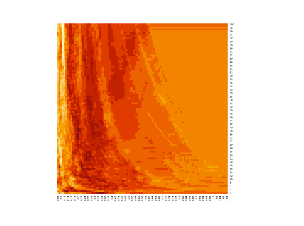
Next up, let’s look at the Maximum Drawdown heatmap. For each of these roughly 10,000 backtests, we observed the maximum drawdown and find this pattern:

Whoa, cool huh? Almost exactly the same sweeping pattern as the returns heatmap, with perhaps a little less noise. In particular, you can see that there are about three narrow trends of darker colors sweeping through the heatmap (the middle one is fainter than the other two). These are trends of persistently higher drawdowns, a trend of strategy “failures” where they all suffered similar drawdowns at the same time. We’ll explore that next in this post, but first let’s look at a comparison between these two heatmaps. Slide the vertical white bar back and forth to compare the annual return heatmap (left) with the max drawdown heatmap (right):


Nice! The dark bands on the drawdown (highest drawdowns) correspond to lighter bands on the annual returns heatmap (lower returns). So superimposed on the overall trend we noted earlier of longer lookback periods yielding somewhat higher returns, we see distinct bands of strategy failures that interrupt our overall trend.
This is useful information. Let’s examine one of those failure trends more closely. Specifically, we’ll look at the leftmost band, and see what the “failure” really was. I’ve picked a relatively clean section of the band at 44 days for the lookback period, and we’ll look at three strategies across that band, one to the left, one to the right and one in the peak max drawdown band (which is also in the band of lesser annual returns).

Let’s compare:
* Strategy 1 (green): CAGR 6.4%, MDD -54% (highest MDD, lowest CAGR of strategies)
* Benchmark (red line): CAGR 9.3%, MDD -55%
* Strategy 2 (black): CAGR 7.7%, MDD -38%
* Strategy 3 (blue): CAGR 8.5%, MDD -47%
Visually, it looks like Strategy 1 has a bad tumble in late 2008 and just never catches up. Let’s see if that’s really what happens… rerun the backtest from July 2009 instead of July 2006 and…

Whoa, you can barely even see that there are three strategies here, alongside the benchmark. And in fact, the main reason for this is fairly obvious: we’ve set a threshold value ranging from 0.35 to 0.45, which is very high for realized volatility. Even the VIX rarely reaches over 35, and RV is almost always less than Implied Vol, so there would be very few days in those 10.5 years in which to differentiate. So nearly ALL the difference between these strategies comes from those few days where Strategy 1 failed to be out of the market for some big losses during the very volatile period in late 2008.
It is left as an exercise for the reader to similarly explore other bands of high MDD and low CAGR to see what “failure” caused them. 🙂
One final map: the Sharpe ratio heatmap. I think you can know approximately what to expect here:
The Sharpe ratio is higher on the left side (low vol threshold strategies) than on the right side (~100% exposure to SPY market trend). There’s also a negative-slope swooping trend, reflecting the MDD/CAGR anomalies discussed above. I’m MOSTLY liking the higher Sharpe area just to the left of the leftmost big MDD/CAGR anomaly. This is where vol threshold is in the ~0.15-0.30 range and lookback period is 20+ days, and the CAGR is reasonable but the MDD is reasonably low. Run some experiments in there, see what you think. BUT REMEMBER (note to self), this is getting toward cherry picking. Just because those params helped avoid the worst of the 2008 drawdowns doesn’t mean they’ll be the right ones to help avoid the next round of drawdowns. We’re not nearly done yet, but we’re making progress I think.
What have we learned? I think this…
* There is one big overall trend of longer lookback periods giving higher returns for the same volatility threshold
* There are meaningful “failure” trends superimposed, where some particular aspect of the strategy led to increased drawdown or missed opportunities to join a market rebound
* There is also some sparkly noise throughout the heatmaps, causing little dark and light spots, representing smaller local return anomalies
* Unexplored here but apparent on the heatmaps is a broad region of small anomalies, both highs and lows, in the very short lookback periods from 2 to ~14 days. We’ll explore those at some point here.
Did we advance our efforts toward our goals in this post? Well, we certainly didn’t beat any benchmarks today, but that wasn’t today’s effort. Our #2 goal was:
2. develops signals based on sensible, logical, statistically meaningful market observations (like realized volatility)
Simply exploring and understanding our data in more detail, right down to individual anomalies and their origins, is perhaps VERY important in making sure we have a logical and robust strategy in the end. I said at the beginning of this post that I want to avoid cherry-picking parameters to meet the goals… these aren’t just “the” goals, they’re my own strategy-researching goals, so that I can build my accounts safely and strongly and retire someday. I won’t get there from my enormous part-time salary at a non-profit, or from what we grow and sell at the farmer’s market, so it’s going to have to come from here. You’re welcome to come along.

Leave a comment